Friday, 7 October 2011

Research into Film Posters- Action


This is a film poster for the film G.I.Joe rise of the cogra. This is what the audience would expect in an action film poster, being very explosive, with the gun being fired. It adds intensity to the poster because you know something is going on. He seems to be in some kind of army or combat gear, showing what the themes of the film. It meets the conventions of an action poster because there is a guna dn a moody looking actor in it, showing the audience what is to be expected. The colours in the poster are similar to that of fire, so it shows the danger that will be in the film.


This poster for the Wolverine film, there is blue tones in the background, this is a bright colour but not a happy colour, showing the moddy tones. The ctors are all in the shot, but the main charcter is at the front, looking like he is the leader of the pack. He is clenching his fists and has a very serious look on his face showing intensity and anger, as if something has made him angry. The tohers in he background all have the same facial expression, as if they are about to have a fight. This follows meets the expectations of the potential audience because it shows how there is going to be some kind of confrontation going on.


This poster for the A-Team has all the main characters in, they are all standing around each other. They all seem to have some weaponry in their hands, showing that there is going to be some violence and action in the film. This may intrigue the audience knowing that they are going to get some excitement when watching the film. They are standing around in sand, this shows that the location for the film is going to be like this, somewhere in the middle east where there is plenty of land like this for instance. 'There is no plan b' this is a line for the film that shows that they are ready for action and that what they say goes. Their facial expressions are all quite different, with 3 of them having intense and serious looks on their faces whilst the other is smiling, showing that he may bring some fun into the film.


Research inot Film Posters- Comedy


This film poster for the film 'Bad Teacher' is very amusing, showing the starring actress, Cameron Diaz. The image is of her asleep on the her desk, showing how she doesn't care about the class she teaches. She is wearing quite inappropriate footwear for school and sunglasses, so she is not a typical teacher. It says towards the bottom of the image that 'she doesn't give an "F"' This is a pun playing on the swear word and the grade that a teacher would give a bad student. On the board behind her there is the names of the stars of the movie, showing that it is not just her. This may excite the potential audience knowing who the other stars are and may make them want to see it more. The colours in this poster are very simple, what you would expect to see in a classroom, all equip even with a very stereotypical apple, with a label saying 'eat me' on it. Meeting the audience's expectations. The attention for the poster is gained by having a lot going on but it all being relevant to the main character and what she is doing. Someone may see that a teacher has fallen asleep at her desk and appears to be hungover, and see the witty pun in the tag line and find it humorous.


This is the poster for the popular film 'The Inbetweeners Movie' this shows the popular characters stood next to each other and all showing different expressions. In the background there seems to be a strip of nightclubs and everything you would find on holiday, they are going on a 'lads holiday'. It has a great deal of bright colours showing excitement and fun. The bright lights seem quite blurred showing the boys may be in a trance with it all, and it is showing the main focus is on the four boys.
The potential audience for this film would be young adults all the way through to people in their late 20s. This means that the audience is quite broad, but because the series was such a huge success means that they already have a following.


This is the film poster for the film Hangover part II. It is of the 3 main men, all looking very hungover and in some trouble. They are all on the floor with one lying on the floor with a monkey on the back, which is quite amusing. One of them has a tattoo on his face and looks very scared and worried. The other has his head shaved and looks very concerned. This is all very funny and the audience would find it amusing making them want to go see the film, just to see how they got themselves like that, and what went wrong this time. The phrasing at the bottom 'Bangkok has them now' is very funny because it shows they have no control and the place they are in has got them in some trouble.
The tag line in this poster, 'the wolfpack is back' would be quite hard for the audience to work out if they have not seen the first film. As it is a sequel the audience for the film may be limited. However, for those that have seen he first film will get excited by this and want to see it, to see what they have been up to this film.


The message you tried to print is protected with Information Rights Management. You don't have the necessary user rights to print the message.

Research into Film Posters - Thriller


The colours in this poster are very dark and moody, creating quite a scary atmosphere, something that we may incorporate in our own poster. With red the only real stand out colour, this colour is one of anger and sometimes blood, so it could have connotations that something bad is going to happen.


The main foucs of the poster is the star, Leonardo DiCaprio, this could be the poster's USP, because he is a very well known actor.
This poster of Shutter Island shows how there is something going on. Thriller films are all about the unknown, building suspense and tension. The way that the actor is looking out the corner of his eye assumes there is something sinister going on and that he may have to watch his back.


The lit match is important for the image because it gives an illusion that he may be going through a dark place and needs that light. This fire contrasts with the rain in the background of the image. On the lower part of the image there is an island, it seems as though there is no happiness or light at all on this island. It looks very scary and not somewhere you would want to be trapped. The wording on the poster is very simple but leaves a huge impact to the onlooker, 'someone is missing.' this makes the onlooker and potential viewer of the film intrigued into what this film is about and how someone could be missing and if they are going to find them.
This poster is very effective because there is a great deal going on but the main focus is the actor, and his expression meets the genre conventions, of mystery and concern. The tones of the poster appeal to an audeince who like the actor but also like a film that makes you think but at the same time quite scared.


This poster for Disturbia is quite simple, just black and white. The binoculars are the only source of colour on the whole poster, this is significant because you can see what is inside the lenses. A girl looking very scared in the foreground and a shadow of a man holding a knife in the background. This is quite a haunting image. It shows how the main character is the observer of it all, leaving the question of will he be able to save the girl who looks like she's in danger. At the bottom of the image is some houses, this looks like a neighbourhood, meaning that the main character is looking over all of the neighbourhood. His face is very white contrasting with the black background, this is a good effect, it is very simple but engaging at the same time.
The tagline is very effective because it gives the audience something to think about when reading it, 'every killer lives next door to someone' it is quite long but sends a message to the audience about where they live. As they do not mention the actor it seems as though he is not very well known, because normally with film posters the actor can be used as a USP. They are taking a risk with this poster by not including names.
The intended audience could be a younger adult, purely because the two charcters that ar ehsown in this poster seem to be around the age of 17/18, so poeple that age may be more prone to see it.


This is a very effective poster because it meets the conventions of a thriller poster, with the dark colours and the rather scary image in the binoculars showing something bad is going on.


This is the poster for the movie Salt, it is again simple with only her face as the image. There is darkness all around her apart from her face, this insinuates that the film is all about her. The word 'salt' seems to be planted on her face, as if it is a label that she has and upholds in the movie. It says the starring role, Angelina Jolie and no other names meaning that she really is the main character. She is defiently the USP of the poster, this is because she is a very well known and popluar actress so for the fil to be all abou ther would most likely excite the audience to go see it. Towards the bottom of the poster there is a question, 'who is salt?' this is engaging and would make the onlookers and potential audience want to know the answer to this question.
The intended audience could be someone of their mid to late 20s. This may be because of the actress and who her market could be.
This poster is not very effcetive because it is very simple, and you don't know a great deal about what it could be about, leaving the potential audience wondering what it is about.


The message you tried to print is protected with Information Rights Management. You don't have the necessary user rights to print the message.

Tuesday, 4 October 2011

For our movie poster we wanted the audience to get the genre and tone of our movie by seeing the poster. We decided to take pictures in the woods as woods are a convention of thriller movies. Below is the images we took.


1.


2.


3.


4.


5.


6.


The first three images fit in with the storyline of our thriller film, as in the storyline Sam's husband is murdered in the woods whilst sam waits in their car. I think that the lighting in the first three look like car headlights which we can exaggerate more on photoshop to make the storyline more aware to the audience.

Out of these three I think the first picture will fit in the best as the silhouette of the trees against the sky and the moon has a dramatic mysterious effect. We will import this photo into photoshop and edit it to make ourn film poster.


Looking back however we decided to not use these images because we thought these images did not look high quality and therefore want to come up with more images.

Thursday, 29 September 2011


After looking at all we filmed we realised that there was a great deal to cut out and modify, so we started to edit. We used Adobe Premier Pro. Firstly we opened it up in windows media player, however it wasn't the best quality and we were unable to edit. Premier enables us to cut out bits that we didn't want and play audio files over the video.


This is an example of a shot that we have cut out. Reason being because you can see the reflection of Charlotte in the window, and the sound is not very good because it was filmed outside.


We looked over the whole filming and picked out bits we did not want to edit further and chose what we definitely did not want, for example shots where we were laughing. 


We looked up on Google tutorials for Premier Pro to help us when editing so we could use the best effects and tools instead of guessing. So for cutting out bits we used the 'razor' tool. This allowed us to click on the bits we did not want and then select them and 'cut'. Once we cut it a couple of times it was very simple and quick. 


After choosing all the bits we did not want we were left with  a series of good shots, that we were then going to have to whittle down to the final trailer shots. 


Website that helped us know how to cut out some parts of the video:

Filming

When and Where: We filmed our trailer in July. We organised to have our friend, who is a drama student, to come over to be in our teaser trailer. We organised it so that we shot on a night that Fiona our actress and Charlotte's mum's boyfriend, Richard, could both do.We shot the trailer in the evening, and experimented with many camera angles and shots so that when we edit our trailer we have plenty of varied shots to choose from and pick the best.
Before shooting we emailed the script over to Fiona so that she could learn her lines in plenty of time.

First Scene: We started off with the first scene of the trailer, where our actress had to stand by the mantel piece on the phone to the detective's voice over. We played the voice over to Fiona so that she would be able to get the timing right about when to start talking. When editing we will obviously play the real voice over over the clip so it sounds loud and clear.
Shots: When we filmed that particular scene wanted there to be plenty of shots, so we filmed a mid shot of Fiona and then an over-the-shoulder shot of her, and a series of close-ups.

Second Scene: The next scene involved a second character, Norris the nosey next door neighbour. His part was to alert Sam that he had just seen something in her back garden.
Shots: We did a series of shots for this scene. Involving different over-the-shoulder shots and close ups from both character's point of view. We also did it from different areas, so from the outside looking into the house, from the corridor, and behind Sam in the doorway.

Third Scene: This scene is from the Kitchen. This is where Sam runs into the kitchen to look in her back garden to find the kitchen window wide open. This alarms her so she searches for a knife to protect her. This scene was quite hard to do because we wanted it to look as real and as authentic as possible.
Shots: We did quite a lot of shots to make sure we got it from every angle possible. We got it from the doorway of her running in, from one corner of the kitchen and the other, from outside in the garden looking in the kitchen, and following her in the kitchen. We also did some close ups of the knife and of her searching for the knife in the drawer.

Fourth Scene: This scene was a fairly short one because it was just her running through the hallway and up the stairs.
Shots: We had a shot from downstairs looking at her running from the kitchen and past the camera up the stairs. We also did shots from the staircase following her running and at the top of the stairs as she is running towards the camera.

Fifth Scene: This is the penultimate scene, and is the one where she looks into her children's bedroom and sees if they are safe.
Shots: We had a shot from inside the room watching her come in and sigh relief. With shots of the child so that the audience would know what Sam was looking at.

Sixth Scene: The last scene is a very important scene, the one where the suspense has risen and the climax where the tension is building. We had it so that she would be relieved to find her children safe in the bedroom but then there is a creaking door being opened. And she walks towards the door.
Shots: We had a few shots for this scene, where we were behind her and her was walking backwards and then quickly turned round when the door opened and then we were further away from her.

Problems: For the second scene, lighting was a bit of an issue, because we wanted it to be more darker but it was still light outside. After a few shots with natural light and then we decided to put a table lamp on in the landing, this made it more believable that it was night time.

Tuesday, 5 July 2011

Preparation for the Shoot

The day before we planned to shoot our trailer, we went to the location where we are going to shoot and prepared it for the next day. The reason why we decided to prepare the day before was so that on the day of the shoot we didn't waste the actress's time and also so we coukld focus on other aspects such as lighting and camera angles.

For the childrens room, we needed to make sure that we made the bed look like it had a child in it. Below is an image of how we did this. We used a pillow for the body, then we got a toy and put a wig on it, on top of the toy we then put a childs pjama top on it just in case you do see the top.


This is a picture of what it looked like with the covers over it.

We used a childrens duvet cover over the orginal bedspread to make it look like a childrens room and also we added pillows and teddy's which again will add the effect that this is a childrens room.
The other room is house that we are shooting from is the kitchen. We needed to preapre this so that everything that's in shot is part of the mise-en-scene of the character we have created.


These are the particular props that we will be placing around the kitchen on the shoot to make it look like a family kitchen. Without these I think the audeicne may think the kitchen is just a normal kitchen which we have filmed in, however we want to make it apparent to the audience that this is a family kitchen. the baby bottle, baby food and toddlers cup suggest there are children present and we will arrange these around the kitchen when we shoot the trailer.


However because our chracter Sam is troubled because her husband just died, we want to show that she is troubled and may need something to wind down. For this we are going to place a bottle and glass of wine in the kitchen. This will show the audeience that she is troubled.


Because we didn't want to buy an authentic bottle of wine, we got a empty bottle and used red food colouring and water which made the water look like wine. This way we can pour as much as we want without having to worry about wasting it andf it still looks like a alcoholic beverage.

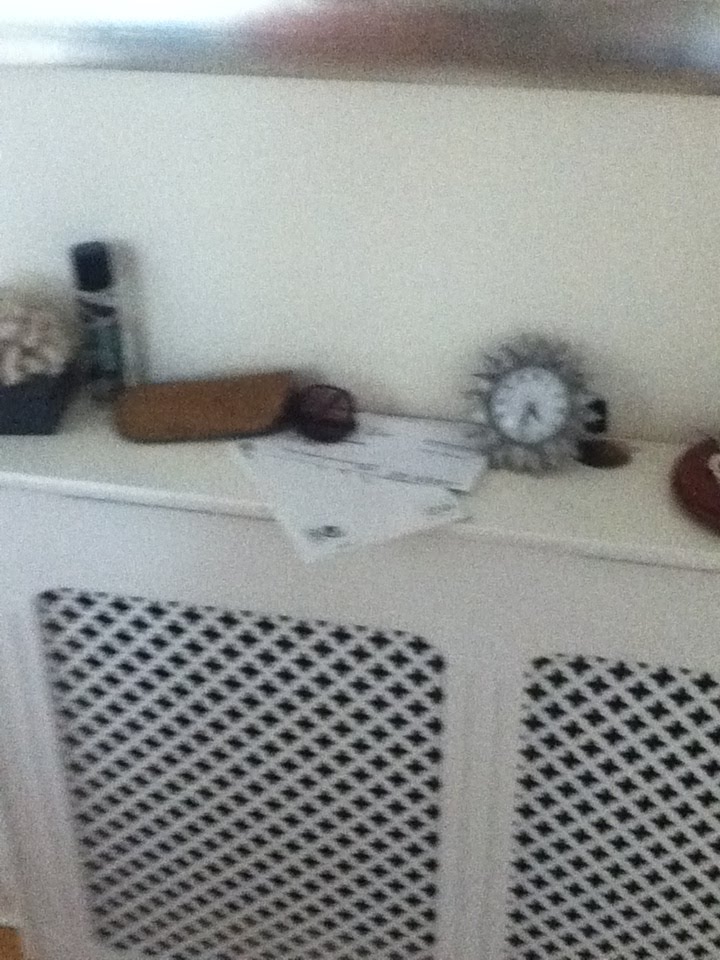

In our trailer the charcter Sam walks past the mantlepiece which we arranged to also add to the mise-en-scene. We put some post on the side which makes it seem as if she isn't organised at the moment. the sunglasses suggest that she is a girl and the clock and the keys just represent a normal mantlepiece in a house.
For the first part of the trailer when the charcter Sam is on the phone to the detective we are going to shoot it in front of the this mantle piece. This will be in the background and there will be a close-up shot of the picture of the charcter Sam and her husband.
We printed this picture out and put it in the phtot frame. By having this photo on the mantlepiece shows that the charcter Sam doesn't want to loose the memories that they once had.
Also on the mantlepiece we placed a picture of a child which suggests to the audience that the child lives in the house. Although this won't have a clos-up, its still important that its in the background subtly.