Sunday, 4 December 2011

Evaluation 3


Click to see Audience Feedback


Poster:


Our audience feedback for the poster has influenced our final product.


We asked 8 people to look at our original poster and give their opinion on it in a short sentence. This gave us a great insight into how our target audience react to our products. The font was an issue, the majority saying it was too simple. This worried us because we knew that font was a main part of a film poster. It could determine how the genre on the film comes across. We changed the font to a more interesting and 'thriller' suitable font. We can see now that it is focal point of the poster and makes the whole poster look much better. After looking back at audience feedback we have modified the poster in a way that now looks more realistic and meets the thriller conventions more.


Magazine:
From our audience feedback for the magazine front cover we learnt that the overall view of it was OK. Due to timing we are not able to improve on any of the points made by our target audience. If we did, we would probably include something about thriller movies, this would give the audience an incite into the what the movie may be like. The picture is good, but a tad blurry, this is due to the software we used. We found InDesign quite hard to operate so we couldn't get the picture that size without blurring it. For the magazine we just wanted it to look realistic which we think it does, and even though it may not seem like a thriller film, the front cover of a magazine is not meant to cater just to the main title. We added the special edition, which someone picked up on, this makes it look realistic and if we were to do it again we know that we would keep that in, as well as the text and the sticker. The title went down quite well, we now know from the audience feedback that it was successful.


Trailer:
From our audience feedback about the trailer we found that it mostly positive. Majority likes it and said it was dramatic, which the main basis for a thriller trailer, so we think we have achieved a good trailer. Some people commented on how it was a bit shaky, this is a technical issue of not keeping the camera steady enough. To improve this we would have placed the camera on a tripod or a surface when filming. With the interviewing we learnt that it has quite a good response, not too much criticism. Overall rating about 7/10.


Audience Feedback

POSTER feedback. We asked 8 people to look at our poster and give their opinion on it.


The font has been a big issue with the poster, people have said that it is too simple. The simplicity of the whole poster has also been mentioned, this is something we worked hard on to get right. However, we don't want too much to be going on and to make it cluttered so we'll try to make it more realistic by having the information at the bottom and for there to be tagline.


TRAILER feedback. We have got some people to watch our trailer in full and give their opinion on it.


From this we found no real problems, or issues that needed immediately changing so we kept the trailer the way it is.

We also created 5 questions to interview members of our target audience after watching the trailer giving their thoughts on it. We asked the following 5 questions:


  1. Do you think the trailer successfully met the conventions of normal thriller trailers?

  2. Did you feel the picture and magazine went well with the trailer?

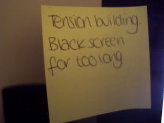
  3. Did you feel the suspense building?

  4. How would you rate it out of 10?

  5. Based on what you've seen would you go watch the film if it came out to cinemas?


Answer 1.
1. Yes it was very similar to traditional trailers, the music was definitely a good point to it because it made it seem like a normal trailer.
2. Yes, the poster more than the magazine, because the poster added to the effect on the genre.
3. Yes especially when she was running up the stairs because the music and the suddenness of when she opens the door is surprising and when the door creaks it builds tension.
4. 8/10
5. Yes because the storyline seems quite good.


Answer 2
1. It was very cliché of a thriller trailer, with the knife and running up the stairs.
2. Yes because it all involved the same person.
3. Yes towards the end, very good ending.
4. 6/10
5. Er maybe.


Answer 3
1. Yes because it had the suspense building and it had the production titles and the green start, this makes it more realistic.
2. Yes because the colours and images were all to do with thriller.
3. Yes because the music and script were all leading to the ending.
4. 8/10
5. Yes, good storyline and I want to know what happens next.


MAGAZINE feedback.


For our audience feedback we asked some people from our target audience to have a look at our magazine front cover and give their opinion on it.


From this there were no major problems, and we are generally quite pleased with the way the magazine looks, and with the feedback. Main thing people said was that it did not look the advertising for a thriller film.


Evaluation 1

Friday, 2 December 2011

Magazine Images

We got our main character to pose for the pictures for the magazine front cover. Her brief was to wear the same clothing as what she did in the poster, this will help make the ancillary texts flow well with the trailer. We asked her to have a stern expression. Moody/sad type of look.


We tried different lighting and using the flash on the camera and positions to get more variety in the shots.


Final Magazine


Thursday, 1 December 2011

Evaluation 4: How did you use media technologies in the construction and research, planning and evaluation stages?

We have done a previous blog post on what hardware items we used for our film production in this post here
http://charlottereynoldsa2.blogspot.com/2011/11/hardware.html


And in this blog post we talked about the software we used
http://charlottereynoldsa2.blogspot.com/2011/11/software-used.html


1. Soundbooth- to edit certain sounds that we recorder to get them crisp and sharp we used the programme soundbooth. We used it to get out beginning sounds that were not supposed to be in the clip, which made the sound sharper. We also used it to make certain sections of the music to be more emphasised than the others, this made the sound more dramatic and effective for our trailer.

2. We used the website 'youtube' frequently throughout our research.
We used it when looking for inspiration with film trailers, it allowed us to search and watch teaser trailers. This helped us a lot because we could then see which genre interested us the most and then looking at the trailers and noting down the common features and conventions used within the trailer. The only con with using 'youtube' is that you can't just type in 'thriller teaser trailers', you have to type in specific film trailers. We really liked the Transformers 3 trailer, the music and suspense that was building reallly inspired us for our own trailer.

3. We also used the website 'IMDb'. This website was great to find out what the top grossing films were at that specific time, we then looked at these films and figured out why they may have been so popular. the only con with this website is that they didn't have teaser trailers, just full length ones and interviews with the stars.

4. Picnik- We used this website when producing our poster. We found that we weren't getting the right effect that we wanted when manipulating our image of photoshop therefore we used this website as its quick, simple and very effective. The only downside to this website is that they charge you for the premium effects, however we didn't use these anyway.

5. FreePlaysounds.com- We used this website to get our copyright free music for our teaser trailer. We played through many tracks and experimented with different effects. There's a large amount of sounds from this website which worked as a pro and con. It worked as a pro because we obviously has a lot of choice, however it was sometimes hard to find a specific sound/effect.

6. Photoshop- We used photoshop when editing the photo's for the magazine. The post-prodcution process was reasonably simple, however we had a big problem with how to sharpen the image. Although we only changed minor things about the photo (exposure, hue/saturation and sharp edges) it definitely made a huge difference to our overall image.

7. Indesign- We used indesign for our magazine. We liked indesign for our magazine cover because we have alot of text on the cover, its easier to manipulate and reposition text on InDesign to fit in with the layout that we had in mind. a downside that we found when creating our magazine cover is that there is a limited variety of shapes, which limited us to what we could use and also made it more of a challenge to edit. Another downside with indesign is when we first started to use it, we found it hard to navigate around. However we know feel more confident with using this program. This helped us overall because the quality was better, the fonts was a big part of conveying the right genre of the magazine and poster. By getting the right colours and the different style of fonts right we were able to show the thriller genre, for example using red and black font.

8. Adobe Premiere Pro- We used adobe premiere pro when editing our teaser trailer. We also used it briefly during the evaluation process. Premiere helped us to be creative with sounds, effects and editing skills. We tried out various effects on premier as it allowed us to be creative and complex. Although it seemed quite complicated to use at first we have learnt how to use it since and are more confident with this program. We tried using 'ghosting' effect but we felt it did not really go with whole trailer and looked quite out of place. Using a tutorial online we looked up how to condense the footage, using the 'razor' tool we were able to create the trailer we wanted by deleting the unwanted scenes.


9. Publisher- We used the program publisher with our poster. This is one of the elements of our production that we would change if we had more time. We originally did the poster a couple of months ago when we originally weren't as confident with Indesign as we were with publisher. However we regret this as indesign is much easier and sufficient to use.

10. Email- We used our email various times throughout Research, Planning, Production and Evaluation. We mostly used it to send files to one another to put on our blogger.

11. Sony Handycam - This was the device we used to film the trailer. We had a quick tutorial on how to use it, but when atucally filming it was very straight forward. We did not use a tripod, which in hindsight would have increased the quality of the trailer.

12. Blackberry Bold- We used this to record voice clips for our Evaluation. We used the blackberry because its easy to send the files straight from the phone to the computer, we used this using email.

13. iTouch- We used the itouch for the voice recordings for our Production. The reason we used the Itouch is because the quality is very crisp. However the bad thing was that at college you can't import the files from the ipod so I had to wait till I got home to import them, which to be honest wasn't too much of a hassle.


14. Sony Cybershot 10.1 Mega Pixels Camera- This camera was used throughout production, planning and evaluation because it took high quality photo's which could be easily uploaded on the computer.