Friday 14 October 2011

Production Title Planning- Survey Results

We narrowed down the ten names to five. These five were the ones we liked the most, we thought to get a clear idea of what would be best we would ask fifteen people within our target audience age group, which is 16-30, what they thought would be the best one.


From the survey we carried out , there was a clear winner. The majority chose Parallel Productions as thier favourite name.


The next step is going to be creating our logo design for our company.

Friday 7 October 2011

Production Title Planning- Name Ideas

For our Trailer we have to feature our own Production Titles. After researching into different names, we came up with these ten ideas.


Venus Productions- We thought this name would be suitable because many of the existing titles all related to the sky or the universe. However we concluded that people often associate the platen Venus with women which is not our concept for our film.


Infinity Productions- this name Went with the concept of being limitless which makes our company seem as if we have no limits on what we can do. The name itself is quite catchy and has a futuristic feel to it.


Mystery Productions- We then thought of a name which would immediatly be assiocated with thriller movies. 'Mystery' is often something that people would often assiocate Thriller movies with therefore we thought it would work well. However, we thought its to cliche and not professional enough for our movie.


Swift Productions- When researching into production companies we found that Warnwer Bros is named after a surname of the founders of the company.So we therfore liked the idea of our company being named after someone, we thopugh of the singer Taylor Swift and thought the name Swift had a ring to it.


Parallel Productions- When thinking about limitless we came up with this idea because Parallel lines never meet and therfore is endless. Parallel could be a metaphor for the link between the audience watching and the film.


Watch Productions- This idea came from the thought of the audience simply watching the film. However, this is again not professional enough and is amateur.


Perplexity Productions- We looked up in a Theasurus the word Thriller to get some more ideas for a name. We choose this word in particular because it sounds sophisticated and also is alliteration which makes the audience remember it more. Although its related to the thriller genre, its not sharp enough to stay in the audiences mind.


Riddler Productions- This is another word we found in the Theasurus next to Thriller. The reason we used it was because a Thriller movie wh=ill sometimes have riddles in it which will challenge the audience.


Sphinx Produtions- When we researched into production companies, the company Tristar has a mythical horse as its logo. This then made us think of another mythical creature which is called a Sphinx. A Sphinx is a creature which bares a riddle which is to be sovlved for it to go away. We thought that this went well with the Thriller genre. However, it may not go well with the theme of our film because mythical creatures are often in fantasy films.


Starlight productions- We thought of this anme, when thinking of the universe again. The name has quite a flow to it, and goes well against other companies such as Universal.

Production Titles Research


Paramount Pictures is an American film company, and the oldest existing film studio. Ranked as the top grossing constantly.
Universal Pictures is the second longest running film studio, after Paramount. As well as films, Universal release popular TV shows too.
20th Century Fox is the distributor for very famous and popular films such as the record breaking Avatar, it also distributes shows like The Simpsons and Family Guy.
Lionsgate Entertainment specialises in a lot of thriller and horror films.
Warner Bros is an well known American distributor which is well know for the numerous Harry Potter films and its trademark cartoon Loony Tunes.
Walt Disney Pictures distributes most of their films internationally, mainly releasing family films.

Research into Film Posters- Action


This is a film poster for the film G.I.Joe rise of the cogra. This is what the audience would expect in an action film poster, being very explosive, with the gun being fired. It adds intensity to the poster because you know something is going on. He seems to be in some kind of army or combat gear, showing what the themes of the film. It meets the conventions of an action poster because there is a guna dn a moody looking actor in it, showing the audience what is to be expected. The colours in the poster are similar to that of fire, so it shows the danger that will be in the film.


This poster for the Wolverine film, there is blue tones in the background, this is a bright colour but not a happy colour, showing the moddy tones. The ctors are all in the shot, but the main charcter is at the front, looking like he is the leader of the pack. He is clenching his fists and has a very serious look on his face showing intensity and anger, as if something has made him angry. The tohers in he background all have the same facial expression, as if they are about to have a fight. This follows meets the expectations of the potential audience because it shows how there is going to be some kind of confrontation going on.


This poster for the A-Team has all the main characters in, they are all standing around each other. They all seem to have some weaponry in their hands, showing that there is going to be some violence and action in the film. This may intrigue the audience knowing that they are going to get some excitement when watching the film. They are standing around in sand, this shows that the location for the film is going to be like this, somewhere in the middle east where there is plenty of land like this for instance. 'There is no plan b' this is a line for the film that shows that they are ready for action and that what they say goes. Their facial expressions are all quite different, with 3 of them having intense and serious looks on their faces whilst the other is smiling, showing that he may bring some fun into the film.


Research inot Film Posters- Comedy


This film poster for the film 'Bad Teacher' is very amusing, showing the starring actress, Cameron Diaz. The image is of her asleep on the her desk, showing how she doesn't care about the class she teaches. She is wearing quite inappropriate footwear for school and sunglasses, so she is not a typical teacher. It says towards the bottom of the image that 'she doesn't give an "F"' This is a pun playing on the swear word and the grade that a teacher would give a bad student. On the board behind her there is the names of the stars of the movie, showing that it is not just her. This may excite the potential audience knowing who the other stars are and may make them want to see it more. The colours in this poster are very simple, what you would expect to see in a classroom, all equip even with a very stereotypical apple, with a label saying 'eat me' on it. Meeting the audience's expectations. The attention for the poster is gained by having a lot going on but it all being relevant to the main character and what she is doing. Someone may see that a teacher has fallen asleep at her desk and appears to be hungover, and see the witty pun in the tag line and find it humorous.


This is the poster for the popular film 'The Inbetweeners Movie' this shows the popular characters stood next to each other and all showing different expressions. In the background there seems to be a strip of nightclubs and everything you would find on holiday, they are going on a 'lads holiday'. It has a great deal of bright colours showing excitement and fun. The bright lights seem quite blurred showing the boys may be in a trance with it all, and it is showing the main focus is on the four boys.
The potential audience for this film would be young adults all the way through to people in their late 20s. This means that the audience is quite broad, but because the series was such a huge success means that they already have a following.


This is the film poster for the film Hangover part II. It is of the 3 main men, all looking very hungover and in some trouble. They are all on the floor with one lying on the floor with a monkey on the back, which is quite amusing. One of them has a tattoo on his face and looks very scared and worried. The other has his head shaved and looks very concerned. This is all very funny and the audience would find it amusing making them want to go see the film, just to see how they got themselves like that, and what went wrong this time. The phrasing at the bottom 'Bangkok has them now' is very funny because it shows they have no control and the place they are in has got them in some trouble.
The tag line in this poster, 'the wolfpack is back' would be quite hard for the audience to work out if they have not seen the first film. As it is a sequel the audience for the film may be limited. However, for those that have seen he first film will get excited by this and want to see it, to see what they have been up to this film.


The message you tried to print is protected with Information Rights Management. You don't have the necessary user rights to print the message.

Research into Film Posters - Thriller


The colours in this poster are very dark and moody, creating quite a scary atmosphere, something that we may incorporate in our own poster. With red the only real stand out colour, this colour is one of anger and sometimes blood, so it could have connotations that something bad is going to happen.


The main foucs of the poster is the star, Leonardo DiCaprio, this could be the poster's USP, because he is a very well known actor.
This poster of Shutter Island shows how there is something going on. Thriller films are all about the unknown, building suspense and tension. The way that the actor is looking out the corner of his eye assumes there is something sinister going on and that he may have to watch his back.


The lit match is important for the image because it gives an illusion that he may be going through a dark place and needs that light. This fire contrasts with the rain in the background of the image. On the lower part of the image there is an island, it seems as though there is no happiness or light at all on this island. It looks very scary and not somewhere you would want to be trapped. The wording on the poster is very simple but leaves a huge impact to the onlooker, 'someone is missing.' this makes the onlooker and potential viewer of the film intrigued into what this film is about and how someone could be missing and if they are going to find them.
This poster is very effective because there is a great deal going on but the main focus is the actor, and his expression meets the genre conventions, of mystery and concern. The tones of the poster appeal to an audeince who like the actor but also like a film that makes you think but at the same time quite scared.


This poster for Disturbia is quite simple, just black and white. The binoculars are the only source of colour on the whole poster, this is significant because you can see what is inside the lenses. A girl looking very scared in the foreground and a shadow of a man holding a knife in the background. This is quite a haunting image. It shows how the main character is the observer of it all, leaving the question of will he be able to save the girl who looks like she's in danger. At the bottom of the image is some houses, this looks like a neighbourhood, meaning that the main character is looking over all of the neighbourhood. His face is very white contrasting with the black background, this is a good effect, it is very simple but engaging at the same time.
The tagline is very effective because it gives the audience something to think about when reading it, 'every killer lives next door to someone' it is quite long but sends a message to the audience about where they live. As they do not mention the actor it seems as though he is not very well known, because normally with film posters the actor can be used as a USP. They are taking a risk with this poster by not including names.
The intended audience could be a younger adult, purely because the two charcters that ar ehsown in this poster seem to be around the age of 17/18, so poeple that age may be more prone to see it.


This is a very effective poster because it meets the conventions of a thriller poster, with the dark colours and the rather scary image in the binoculars showing something bad is going on.


This is the poster for the movie Salt, it is again simple with only her face as the image. There is darkness all around her apart from her face, this insinuates that the film is all about her. The word 'salt' seems to be planted on her face, as if it is a label that she has and upholds in the movie. It says the starring role, Angelina Jolie and no other names meaning that she really is the main character. She is defiently the USP of the poster, this is because she is a very well known and popluar actress so for the fil to be all abou ther would most likely excite the audience to go see it. Towards the bottom of the poster there is a question, 'who is salt?' this is engaging and would make the onlookers and potential audience want to know the answer to this question.
The intended audience could be someone of their mid to late 20s. This may be because of the actress and who her market could be.
This poster is not very effcetive because it is very simple, and you don't know a great deal about what it could be about, leaving the potential audience wondering what it is about.


The message you tried to print is protected with Information Rights Management. You don't have the necessary user rights to print the message.

Tuesday 4 October 2011

For our movie poster we wanted the audience to get the genre and tone of our movie by seeing the poster. We decided to take pictures in the woods as woods are a convention of thriller movies. Below is the images we took.


1.


2.


3.


4.


5.


6.


The first three images fit in with the storyline of our thriller film, as in the storyline Sam's husband is murdered in the woods whilst sam waits in their car. I think that the lighting in the first three look like car headlights which we can exaggerate more on photoshop to make the storyline more aware to the audience.

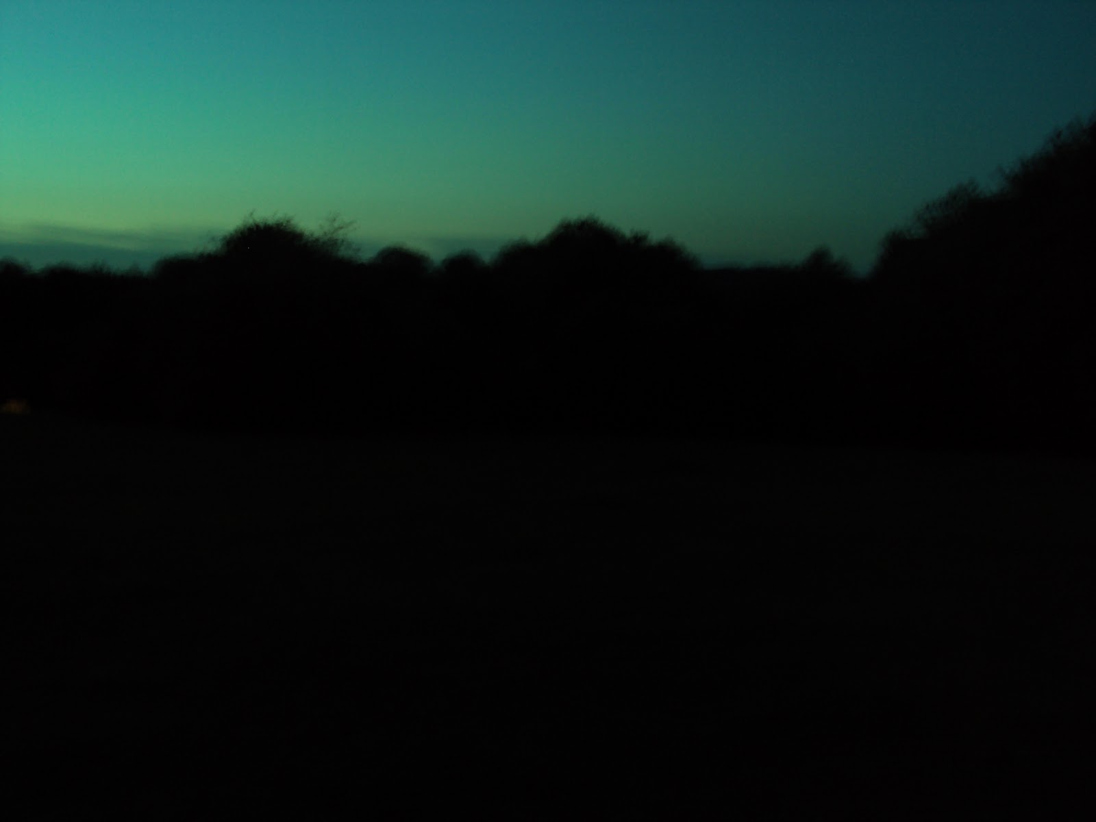
Out of these three I think the first picture will fit in the best as the silhouette of the trees against the sky and the moon has a dramatic mysterious effect. We will import this photo into photoshop and edit it to make ourn film poster.


Looking back however we decided to not use these images because we thought these images did not look high quality and therefore want to come up with more images.